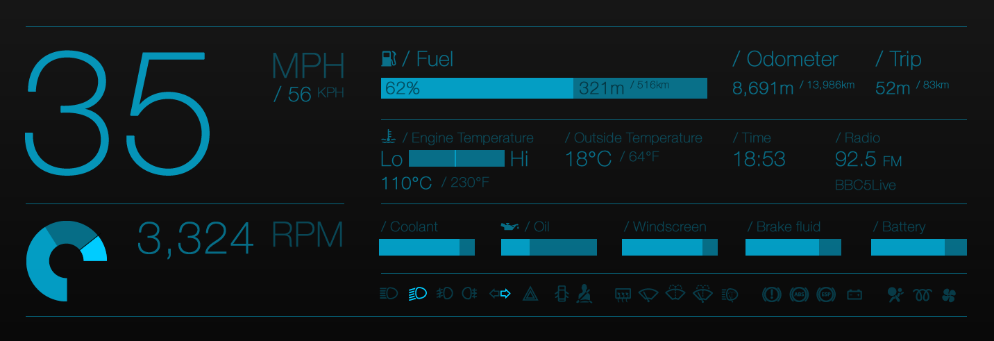
Following many years of driving and recent advances in screen quality, combined with a long night time drive from Scotland to Bath, I wanted to investigate what my ideal dashboard design would be.
In research it seemed clear that it was all still about the dials. Wherever a manufacturer has chosen to move away from this into numbers they always seem rooted to the digital typeface, never choosing to use a clear and legible face. Onboard computers would be relegated to a small section of the display and the driver would be forced to cycle through the options. Surely there was enough real estate there to show all those multiple options such as outside temperature, how much fuel you have left, etc.
What transpired is a typographic solution to a personal grumble. Maybe if I get into car design I can enforce some change from within, but given I don’t know any clients in that sector I’d say the chances are slim. Nevermind, it was fun to think about something totally different for a change and apply my preferences to.

Leave a Reply