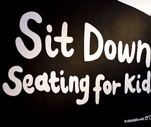
Sit down: Seating for kids exhibition

In 2009 we were invited, in partnership with Wells Mackereth Architects in London, to work on the design of an exhibition on children’s seating throughout the ages at the Victoria and Albert’s Museum of Childhood.
The brief called for an exciting and novel way to deliver the exhibition so as to capture the imagination of the children attending the museum and also to educate them on the subject – it’s not one high on the agenda of most kids!
The brief wanted to play on the theme of Goldilocks and the Three Bears, so the architects quickly seized on the idea of a giant log cabin to introduce the visitor to the exhibition, but it also called for a three pronged attack on the textual information to support the exhibits. Adult ‘level’ information, child accessible information and thematic information was to be displayed alongside each other, presenting a potential communications nightmare.

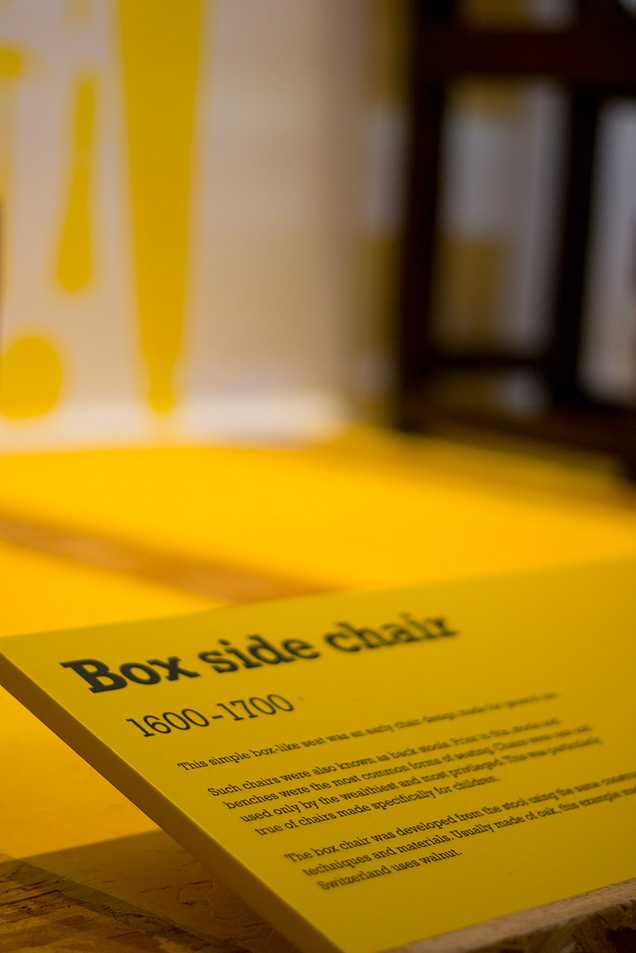
Our solution was to split the design application into two forms, using graphic panels combined with witty and thought provoking illustrated text. This illustrated text posed questions to the reader, led their eye to interesting chairs and design ideas which would engage children and adults alike. Meanwhile the graphic panels gave parents a fuller understanding of the themes and objects on display that they could then relay to the children in their care. Blending the two required real clarity of thought and planning, whilst still giving the illustrator the flexibility during the set-up of the exhibition to add creative touches that could add that bit more humour and humanity to the objects on display.
Meanwhile the architects played on scale to give everyone attending the exhibition a feeling of being a child again in regards to reduced furniture sizes by using oversized furniture design elements such as huge skirting boards, large coat hooks and more.