Category: Portfolio

  • Summer Photobox campaign

    Summer Photobox campaign

    We recently completed a successful TFL campaign for the lovely Photobox, getting their summer message – to treasure the photo’s you take on holiday – out across the London Underground. The simple creative execution puts their core product (prints) at the heart of the ad.

    photobox-summer-2015

  • Seasonal mailings for PhotoBox

    We’re delighted to announce that we will be designing and producing some seasonal direct mail pieces for the excellent London-based PhotoBox to celebrate their amazing products that bring your photos to life; from their most basic digital prints to some brilliant canvas art prints and iPhone, iPad and Galaxy covers.

    They’re timed to go out in the post to coincide with PhotoBox’s first ever TV advert in mid-November (in the UK) and we’ll be following that up with a Radio Times promotion too (that we’re also designing).

    We can’t wait to let you see the work and will pop it on the site ASAP.

  • My Life through Colin and other stories

    My Life through Colin and other stories

    02-Colin-and-other-stories-WEBWe’re delighted to reveal our second book jacket design for Kenneth Paul Stephen’s second book, My Life through Colin, part of his Forgotten Scotland Mini-reads.

    This book is part of, what we understand to be, a trilogy of books that explores the unseen Scotland of real people.

    You can buy a copy from Amazon here for 80p.

  • Book covers

    Book covers

    Sheep-and-other-stories-WEBDoing a book cover design must be easy. Dead easy-peasy lemon squeazy. After all, if it was hard only professional designers would do it. As such isn’t it great that designing your own book cover is a task open to all.

    Or is it?

    We were recently asked to produce an eye catching book cover for Kenneth P Stephens collection of short stories set in the undiscovered parts of Scotland. So what else could we do than start researching book cover design in the post-print world.

    We were amazed, astounded and apoplexy that so many authors are choosing to cut corners on their cover designs. All that hard work, slogging away at their laptops producing wonderfully crafted word smithery and then they wrap it up in something that they bash out in MS Paint in the final evening before the deadline.

    We couldn’t let Kenny suffer that fate so we snuggled down with a decent malt, fired up the iPad, devoured his prose and set to work the following day. The result is above.

    We’re looking forward to the arrival of his second collection of short stories and will serve up the creative solution here when it’s published.

  • Picking even sides is a hassle no longer

    Picking even sides is a hassle no longer

    It’s no secret that I love my football, but every week we have the same dilemma on a Monday night. Working out who is coming is a doddle thanks to RocketSports, but picking the teams is always a headache. If you have even sides, it’s usually a bit easier, but when it’s odd numbers the problems are increased. Who to side with whom?

    Luckily technology can help us with that problem and we’re super excited to be working with Keiran from IntoHand in Bath to develop a prototype Team Picking app for iOS and Android. Current offerings are hideously ugly and unbelievably bad to use – as if the people making them have never hear of UX or UI design.

    Below are sample screenshots of what we hope to launch in the January.
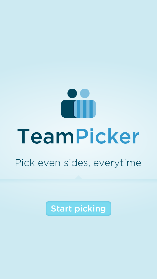
    The Load screen:

    01 Intro and load

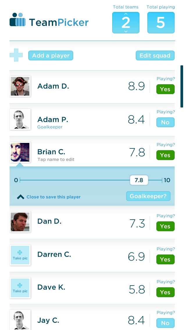
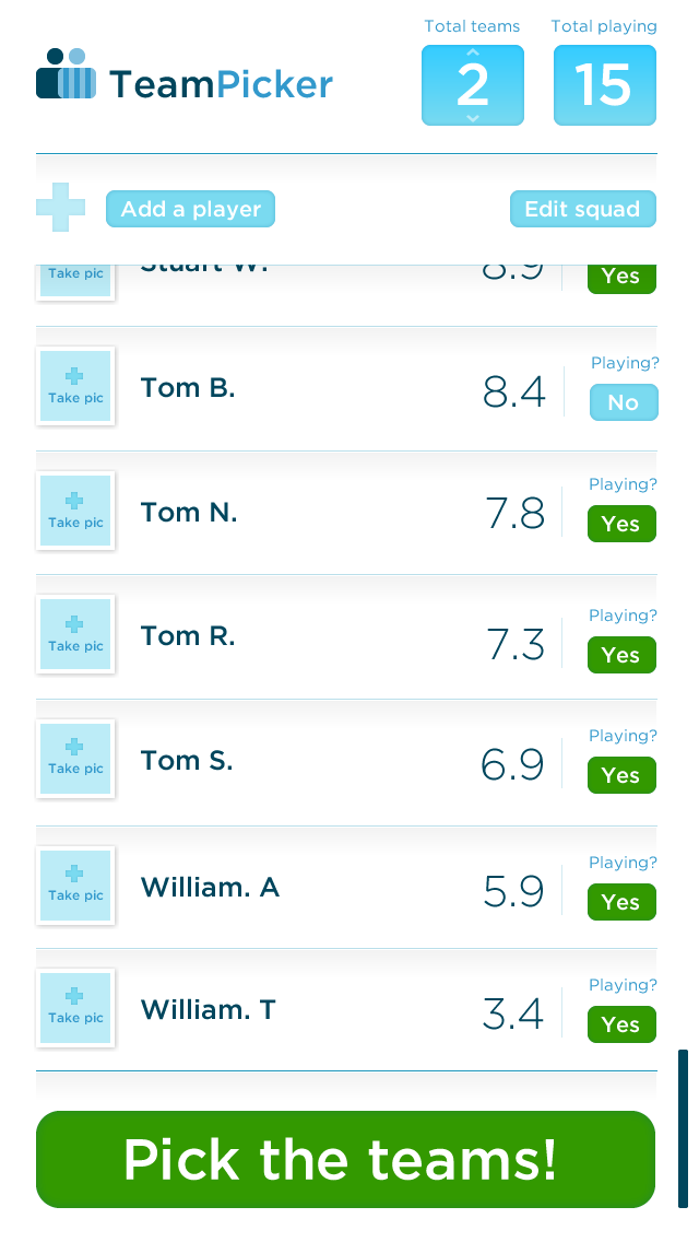
    Your team screen, say who’s there and rate each player on your team:

    02 selection screen

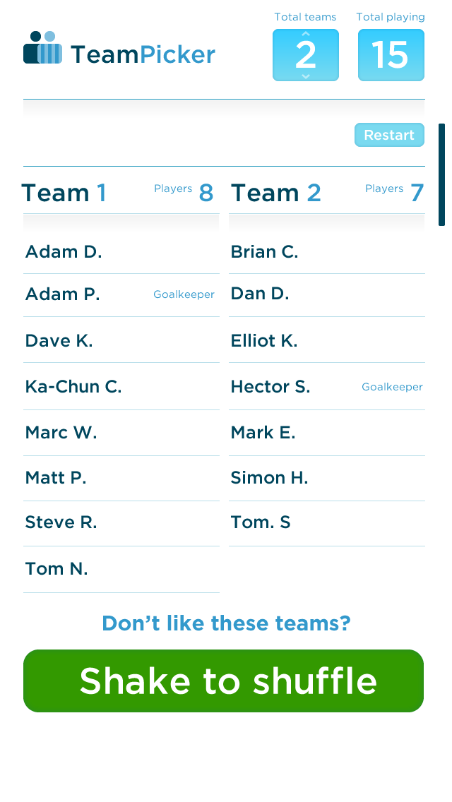
    Pick those sides – a nice BIG button!

    03 selection screen complete

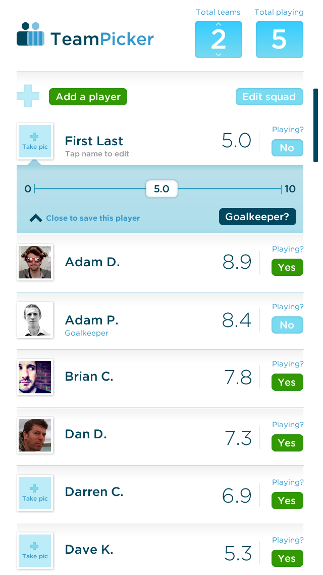
    Adding a player is a simple tap or two:

    04 adding a new player

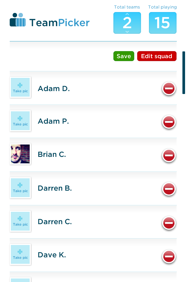
    Edit your squad easily:

    05 editing squad

    Voila! Your teams, picked based on your ratings. Get your ratings right and you’ll never have an uneven game again. It’ll work for any sport or occasion.

    06 Picked teams

  • Plymouth Half Marathon designs

    Plymouth Half Marathon designs

    A new look for Englands “riveria” half marathon

    We were approached at the end of 2011 to work with on some interim designs for the Plymouth Half Marathon in anticipation of a full rebrand for the annual event, this year taking place on the Queens Jubilee weekend. We took our creative lead from old postcards promoting the area as a holiday destination, picking out key landmarks on the marathon’s route such as the Tinside Lido, Smeatons Tower and the Hoe.

  • Our Workbooks made it into Computer Arts

    Not long after we printed our Original Designers Workbooks the lovely people at Computer Arts got in touch to say how much they loved them and could we send a few as they’d like to put them in the next issue. We were only too happy to oblige and a few weeks later this was on the newsagents shelves.

    Original Designers Workbooks in Computer Arts

  • An experiment in vehicle dashboard design

    An experiment in vehicle dashboard design

    Following many years of driving and recent advances in screen quality, combined with a long night time drive from Scotland to Bath, I wanted to investigate what my ideal dashboard design would be.

    In research it seemed clear that it was all still about the dials. Wherever a manufacturer has chosen to move away from this into numbers they always seem rooted to the digital typeface, never choosing to use a clear and legible face. Onboard computers would be relegated to a small section of the display and the driver would be forced to cycle through the options. Surely there was enough real estate there to show all those multiple options such as outside temperature, how much fuel you have left, etc.

    What transpired is a typographic solution to a personal grumble. Maybe if I get into car design I can enforce some change from within, but given I don’t know any clients in that sector I’d say the chances are slim. Nevermind, it was fun to think about something totally different for a change and apply my preferences to.