Author: Brian Copeland

  • We’ve set up home at the Dispensary

    After a short search in our new Bath home we’ve found—and moved in to—the stunning offices at the Dispensary in Bath. From now on we’ll be working out of the converted Victorian drug dispensary with a boardroom in the old doctors consulting room and a 30 seat cinema in the old morgue. Nice!

    Graphic Clinic
    The Dispensary
    8 Cleveland Place East
    Bath BA1 5DJ

    T: 01225 480900

  • New office

    I was worried when I considered moving out of London that clients wouldn’t want to keep working with me/us, fearing their preference to work with an agency inside the M25, but then one of them said “Brian, I couldn’t care less where you’re based..”. I guess we can take that as ringing endorsement that distance is no longer an object in these digital times — and a bit of it is hopefully because they think the service they get is so good they’re happy to work with a designer “elsewhere”?

    So, with that in mind, please note that for the time being (until office premises are found) we can be reached at 01225 480900 which is a Bath number.

  • No sun for us. We’ve had a busy summer.

    It’s been a while since we added some new work to our site, which is a shame, but we’re snowed under at the moment so the chances of getting anything online soon are slim. Of course being busy is good, and we’re delighted to be so. So here’s a quick overview of the last couple of months here at Graphic Clinic.

    We completed a set of album, single and promo designs for 100% Records artist Matisyahu for the UK release of his US hit album “Light” in May.

    In June we produced a gorgeous DVD cover design for Naomi Campbell in gold and silver to celebrate her 40th birthday celebrations.

    July saw us working on the development of our own iPad application – more news will follow soon we hope. We also finalised some logo designs for The Remedi, a designer clothing e-commerce site, and helped them implement the new ‘branding’ into their online shop. We also revamped our client Goldrealm Properties website for Coodham Estate in Ayrshire, a stunning redevelopment of a stately home, and we’ve continued to deliver ongoing design and marketing support for our more regular clients in the financial sector.

    Nucleus, for whom we created their brand over 4 years ago, hit a major milestone in their business aims by reaching a massive £1.5bn + of assets under management on their WRAP platform. A figure that means the business is now profitable, which for a financial services start-up is rather impressive, and we’re delighted to have played a part in their success.

    We also started working for Easy Gourmet, an established ‘high end’ catering and events company based in East London. More new to follow once we finalise their brand strategy and get a new identity developed.

    And that’s not all. We’re putting the finishing touches on an ad campaign for a major pop groups’ new business venture and will be helping the further development a new sports management system with Rocket Sports. All very exciting.

    Phew. Now, back to work!
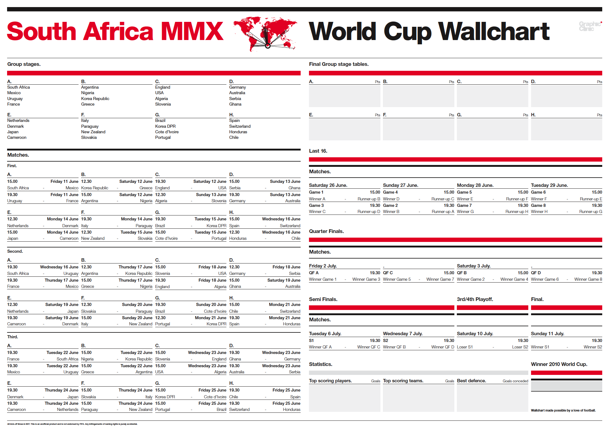
  • World Cup chart competition entry

    Wallchart updated 30/06/10 to include all results to date and Quarter final ties

    Our friends at The Drum magazine are running a competition to design a World Cup wallchart to help follow the up coming tournament this summer. We spent hours looking at other wallcharts out there and decided that a clear, crisp and typographic solution was the way forward. We’re so pleased with it we thought we should share it beyond the competition — after all, it might not win — so we’re putting it online here for you to download and print off yourself.

    We plan to update the chart as the tournament progresses with scores, final group tables, last 16, quarter, semi and final scores and teams, giving you a full picture of the event as it progresses. Can you tell we love our football?

    We should point out that this is an unofficial item and is in no way endorsed by FIFA. Any infringement of copyright or naming rights is purely accidental.

  • Dear politicians: Serve.

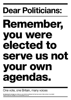
    Dear Politicians: Remember, you were elected to serve us, not your own agendas.After what seems to have been an eternity we are now voting for our next government. There have been lies, subterfuge and more spin than a launderettes on wash day, but now finally we might get a new kind of politics in Britain. However unless we, the British people, remind those that get elected today that we are watching them then we risk another generation of under performance for our politicians. This is why we have decided to create a simple poster that everyone can print out and display in their windows, on the lamp post in their street or indeed anywhere, that will serve as a constant reminder. A reminder that it’s time we got respect from our “Right Honourables”.

    Download our simple PDF and display it with pride: Download it now ››

  • Design is just “fluff”

    Rather surprisingly some people still think design won’t add value to their company, that it’s therefore not worth investing in because it doesn’t matter. Not in real terms. Not in the way that a real service might, like a repair guy fixing your machinery or an accountant who saves you on your tax bill, that’s “real” value. It never fails to amaze me that some people think it’s easy, this design thing, and therefore they devalue the profession further. Sure you can buy—or get free—desktop publishing software that will let you create your own design work for your organisation, so why on earth would you want to pay for a designer to do it for you?

    Perhaps I can offer a reason to recognise why a designer can be worth their weight in gold; and it’s not about a job we did, in fact I don’t even know who produced the design.

    Recently I found myself dealing with something that, unfortunately, many of us will have to do at some point in our lives: deal with an undertaker. Nothing could have been further from my mind than design during this period of immense sadness. We had to choose a coffin, handles, details, plaques and so on—and yes, of course everything had been designed by someone. But even a highly tuned designer didn’t see it and only now, three years later, am I recognising the immense effort these designers made in ensuring that the process was as automated as possible.

    You might think describing something as “automated” when it comes to design is a disparaging comment, but it’s a compliment. I can’t thank the designers enough for making the processes easy. You have a myriad of forms to fill out and when you’re emotionally volatile you don’t want a form to break you, yet the design of the paperwork had clearly been considered. It was a process that we were gently guided through to the point that we barely noticed we had dealt with the hardest thing I think I’ve ever had to do.

    Compassion.. in a form? Would someone using a free DTP program manage that?

  • Grafik Magazine reviews our Original Designers Workbooks

    Last year, not long after we’d printed our 1,000 copies of the Original Designers Workbooks, we sent a few off to Grafik in the hope that they’d put them in their magazine. Alas they didn’t feel they would be right for the luscious pages of their international journal on graphics, preferring to featuring screenprints from the brilliant Anthony Burrill or some super sexy collaboration between Generation Press and Build. We understood. The ODW is a functional design—with a nice clear foil block on the cover—but essentially 200 of the 204 pages are identical. It’s not going to win a D&AD Black Pencil (well it would be amazing if it did, but we won’t put the Bolli on chill just yet).

    What the Workbook does offer is a damn useful notebook/sketchbook. However, having used them in their offices for nearly a year and finding them utterly invaluable, they’ve put our Workbooks top of their “Objektified” list of the most desirable notebooks around.

    http://www.grafikmag.com/index.php?m=GR&sub=GRdetail&id=378

    So thanks to Dan who wrote the article and we’re chuffed you find your Workbook so valuable.

  • More V&A exhibitions images

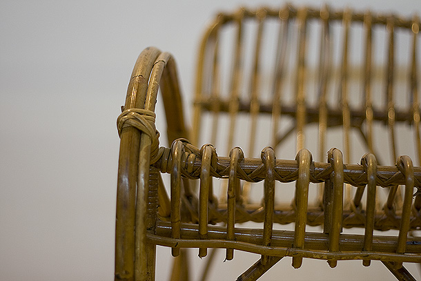
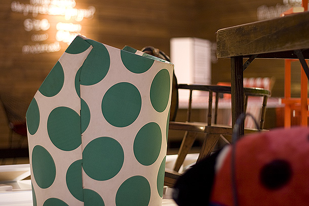
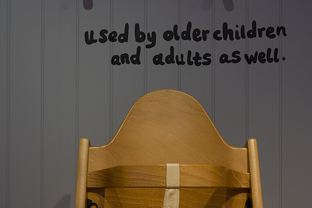
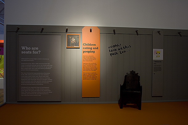
    More V&A exhibitions images

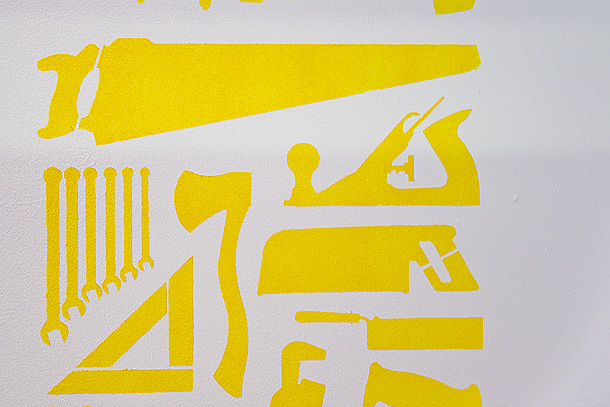
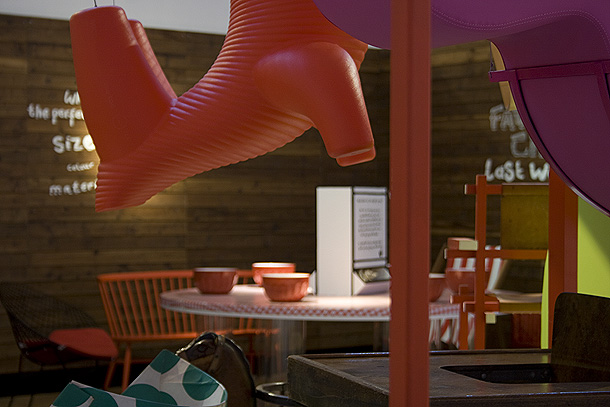
    The stencil produced for the ‘materials’ wall

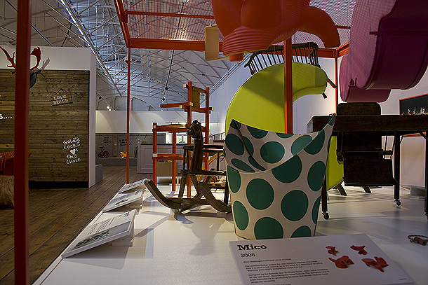
    The ‘materials’ wall, otherwise known as the “How are seats made” section of the exhibition

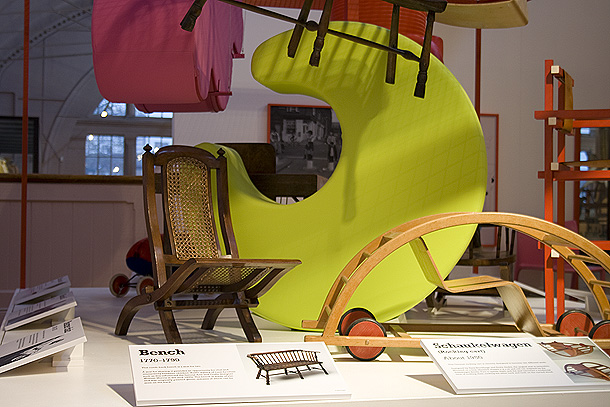
    The “play” section of the exhibtion

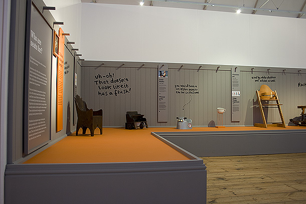
    A Tripp Trapp highchair, something I will be buying for my baby thanks to discovering it during this project

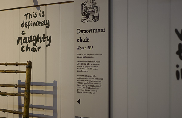
    Some nicely typeset Rockwell. It’s a nightmare font and every headline, and indeed much of the body text in the exhibition required kerning.

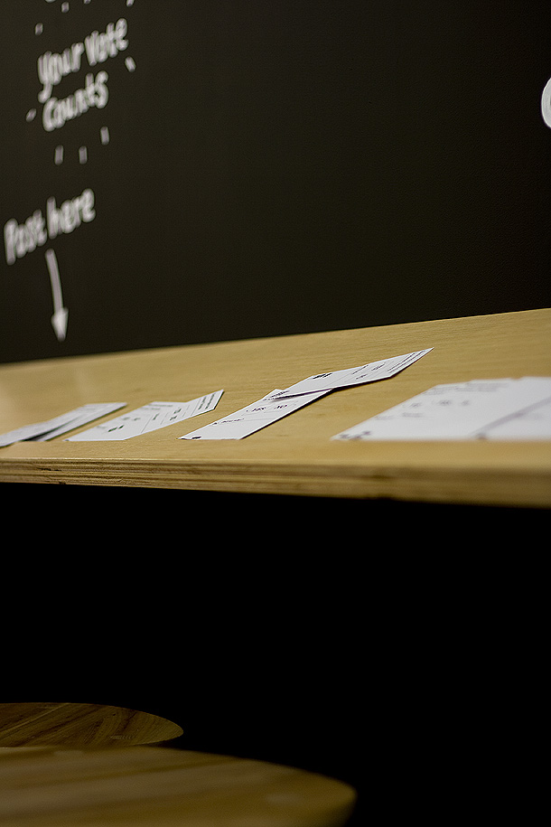
    The exhibition has some interactive elements for kids, for which we produced little voting cards in this instance, so they can vote for whether the stools designed by New Bucks Uni students should go into production…

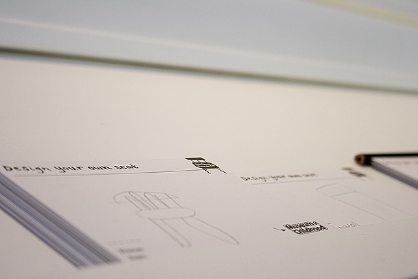
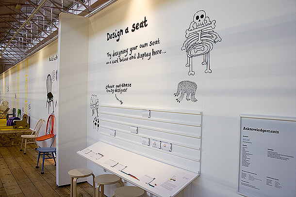
    …and these ones for them to design their own seats and post them for all to see on the wall.

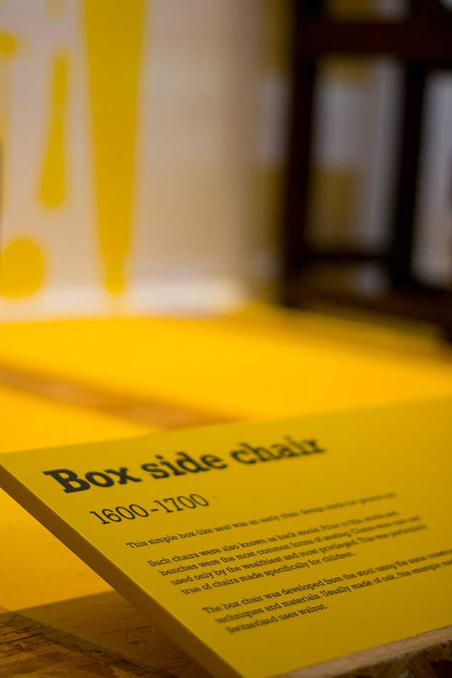
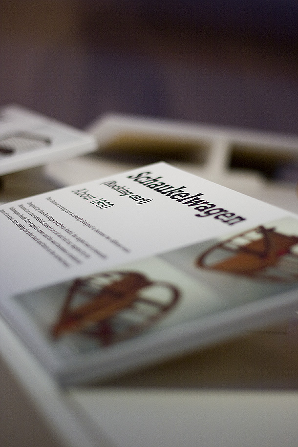
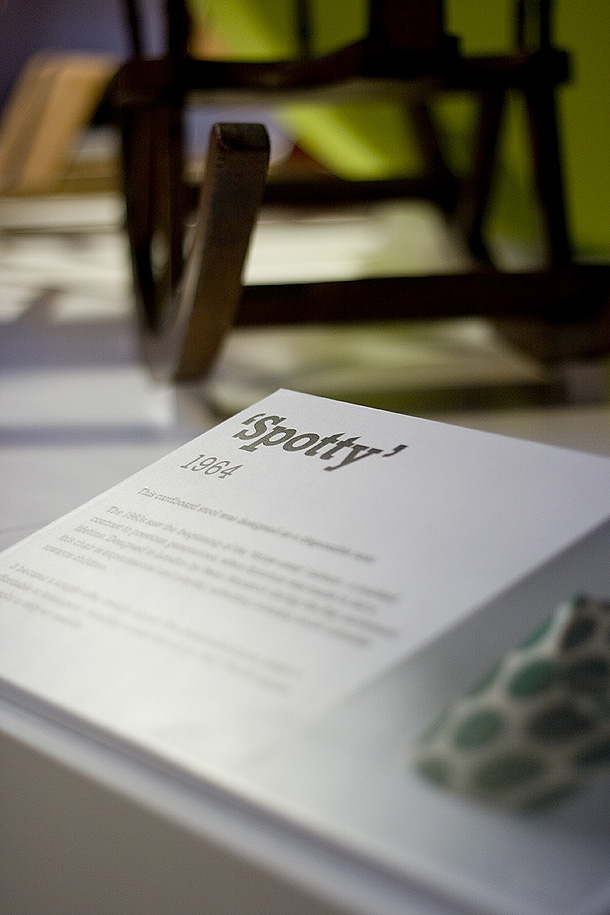
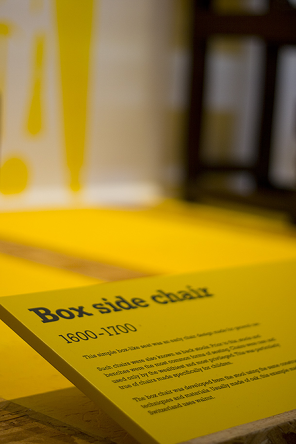
    Details of  object labels

  • V&A Museum of Childhood images from the exhibition

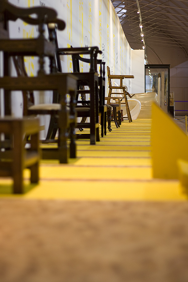
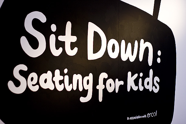
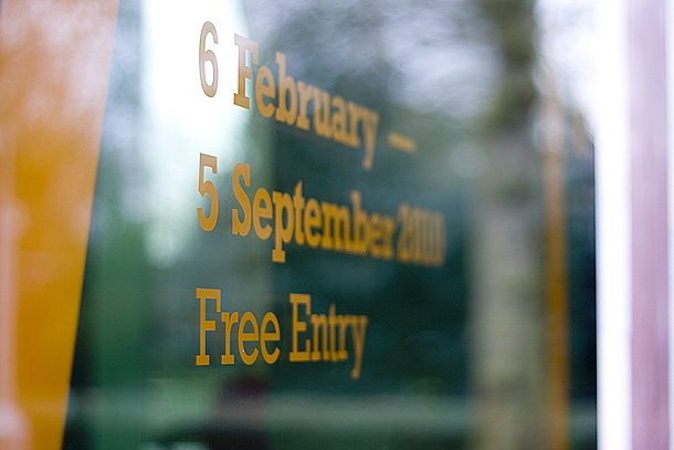
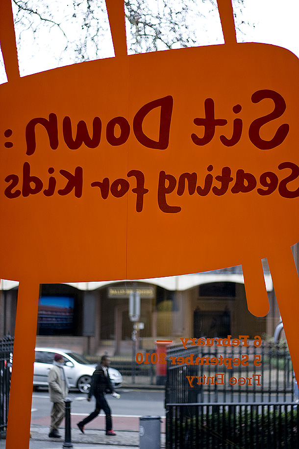
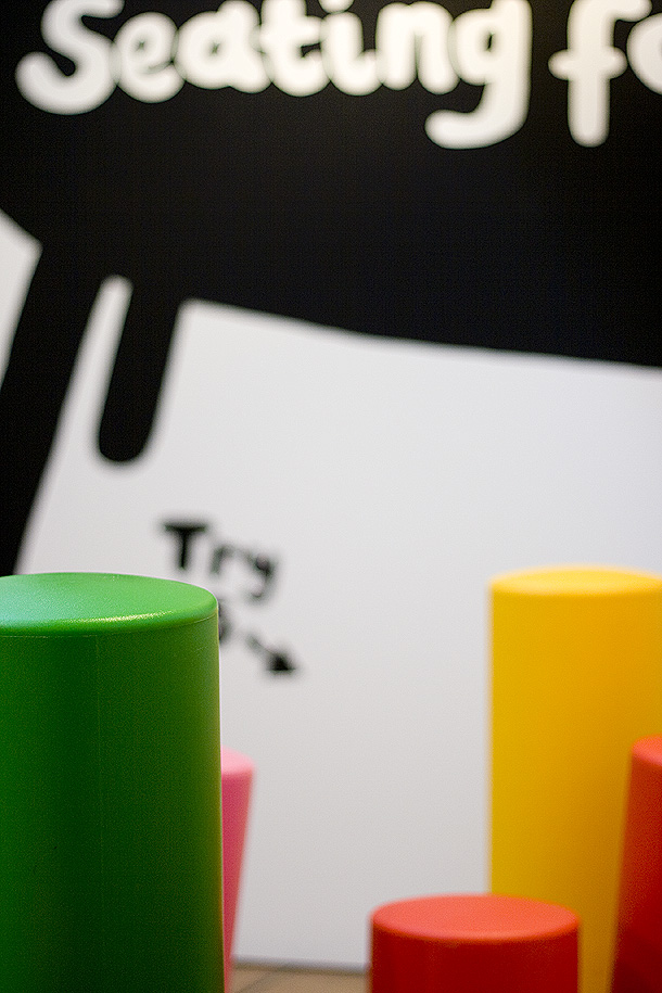
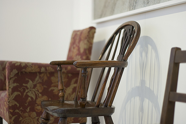
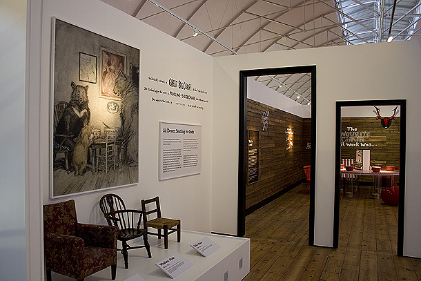
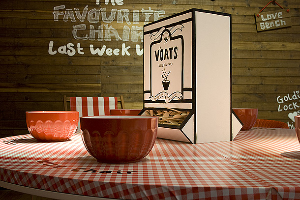
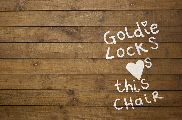
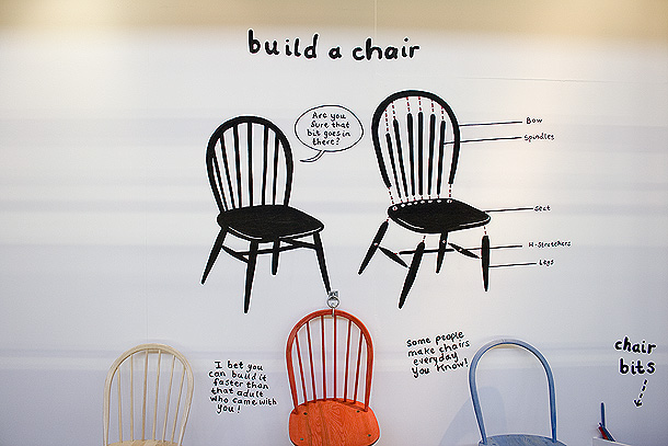
    If you can’t make the time to take a trip to Bethnal Green in London’s east end before September here are a whole load of images we took at the exhibition we designed (in partnership with Wells Mackereth Architects and commissioning Emma Houlston) for the Victoria and Albert Museum’s Museum of Childhood temporary exhibtion on child seating through the ages.


  • Ignite – designing a sub-brand

    We’ve just completed a logo design for one of our long-standing clients, Nucleus, for a new sub brand of theirs called Ignite. Taking into consideration all the factors in a sub-brand design, we’ve produced the shown logo (below). We think it’s spot on and sits perfectly into all their existing marketing material. They think it’s “absolutely brill”, which is nice.

    Ignite logo