Tag: Design

  • UnMute Me

    UnMute Me

    This is an image of an application for iOS that we are developing called UnMute Me.

    We have developed a small app to support people with Situational Mutism, whether caused by Autism or other medical means. The application utilises Apples Personal Voice feature, and other in-built iOS voices, to let users quickly and easily communicate with those around them when their ASD stops them from using their own voice.

    Support

    If you need support for the app, please try these frequently asked questions first. If they don’t help, please email me.

    Frequently asked questions

    How do I create a message?
    Tap on Compose in the navigation. Above that icon is a text box and a circular icon with a speaker in it. Tap that box and it will open the keyboard for the device. You can now type in your message. When finished tap the circular icon with the speaker. You can clear the whole message with the X icon.

    How do I save a Favourite?
    Tap on History in the navigation, find the message you want to ‘store’ as a Favourite, then tap on the star icon to the right of your message.

    How do I change the voice that is used?
    There are two ways to do this, both are done on the Settings screen. Tap the Settings icon in the navigation. You can either use your own Personal Voice, by first granting access to the application to use your Personal Voice, then setting the toggle control to ON. You will now be able to select from the voices created on your device.

    Or, you choose from the Voice section, where the app will show you voices already downloaded on your device — all iPhones come with a few voices preinstalled. You can download more in Settings > Accessibility > Spoken Content > Voices > (pick your language) > Voices (yes, again!) > List of voices and tap on the iCloud download icon next to the voice you would like to use. I would recommend choosing and “Enhanced” voice. They’re bigger files but much better quality spoken ability.

    How do I change the colour of the app?
    In Settings, tap on the circle to the right of the option for “App colour”. It will open a colour picking interface from which you can select a colour.

    Be aware, though, that that app responds to light and dark modes, so try to pick a colour that will work for both – something not too light or not too dark is our suggestion.

    Can I make the readable text on the Compose screen bigger, so it’s easier for other users to see what I want to say?
    Yes! On Settings you can increase the size of the preview message by sliding the value up to the right.

  • Original Designers Workbook latest

    Original Designers Workbook latest

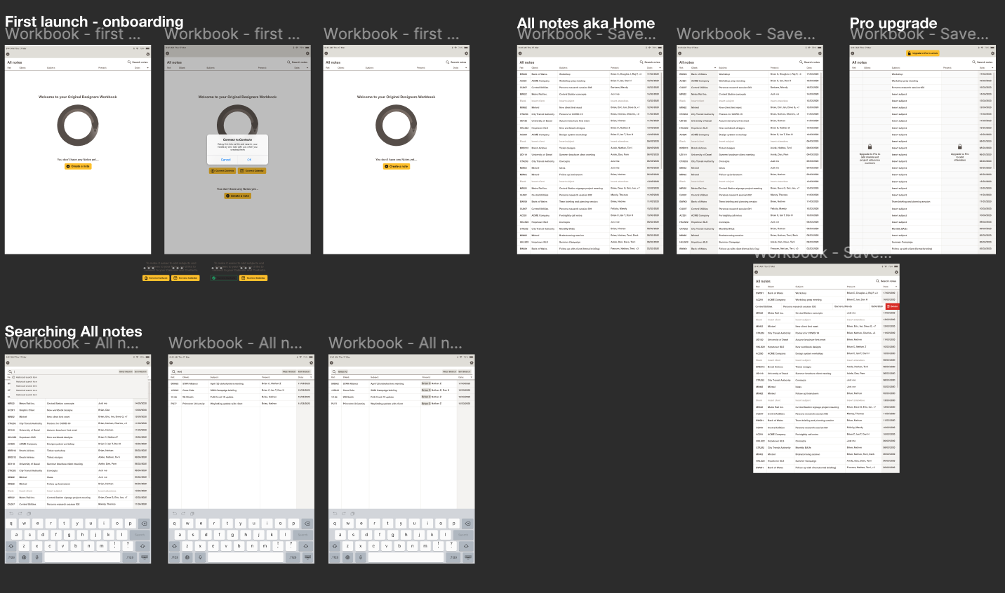
    Work is ongoing to deliver the Workbook app to market. The latest build is being tested and the backlog to MVP being reassessed to clarify just how much work is left to get this labour of love to market.

    The video below is from an earlier build. We’ll get a new one uploaded once available.

  • What we mean by ‘strategy’

    Strategy is a much lauded work in consultancy, as such it means many things to many people. So here’s our take on what is strategy and the consultancy we offer when it comes to the use of this word.

    Strategy, to us, is about devising a plan to help our clients take their product to market. But sometimes it goes even higher than that, it’s a pre-product decision. Our most effective consultancy (on strategy) comes when the product hasn’t been designed yet, let alone the marketing strategy to sell that product.

    Let us elaborate.

    Our most successful client relationship to date is with a financial services company who came to us with an outline of their business. They knew the sector to which they were going into and they had enlisted a group of stakeholders and investors who liked their idea.

    The first job was to work out with this group (of 15+ individuals across 9 businesses) a consensus for what this company was going to ‘be’. Not the obvious ‘be’ of being a financial services provider, but the ‘be’ of culture. What type of business were they going to create. Our work here was about extracting from those individuals what each of them thought in an open forum with their peers, analysing and seeking agreement across all stakeholders to ensure that everyone was on the same page.

    Now we knew what kind of a business we were creating the strategy for we could move on to analysing values, developing personality traits; putting in place the brand strategy. What this essential first-step did was give a central reference point for all future business decisions. It afforded them a clear grounding and a clear direction for growth and has helped them define their proposition ever since.

    In short, an effective strategy.

  • Judging a book by its cover

    Note: This blog article was written for our client Nucleus Financials “Illuminate” campaign. It is due to be published in the autumn of 2015.

    Picture the scene: you’ve got a day jammed full of meetings with new and existing clients alike. Your paraplanner and administrator have already left your a stack of post-it notes on your desk asking you for various decisions, and your 10 o’clock (a possible new client) is late. That’s okay because you can deal with those questions and contact your Platforms CRM to release a new fund for another client. But they’re still late.

    30 minutes after their appointment time a mid-20s, unshaven man, with several piercings and a tattoo poking out of the top of his v-neck t-shirt arrives at the office to meet you. Already disappointed at their lack of punctuality you begin your usual preamble about your adviser firm when his phone goes off. Quite unexpectedly he takes the call, meanwhile you seethe. You’re already thinking this person is going to be a very bad client; lots of work and probably a small income to invest. You’ll no doubt hand him off to a junior member of staff to handle once you get through this meeting.

    We all love to think that we’re intelligent enough not to take people at face value. Not to make assumptions before they’ve opened their mouth, nor to assume the way they dress, or that week-old five o’clock shadow, defines who they are. But subconsciously we do, and then spend the rest of the time fighting those opinions.

    It could turn out our gentleman above is a professional footballer with a £200,000 a week salary or heir to a family fortune.

    But when it comes to the image of a business you really cannot get away with such a lack of care and attention. For as we judge individuals by their ‘cover’, so too do we judge companies. And when we judge them we are much less forgiving. How many times have you searched online for a product or service, selected the first link and arrived on a website that looked like it was created in Word? Or one with a confusing page layout and unclear descriptions? Your reaction? Close the page and try the second link in your search.

    Cover: judged.

    The value of spending due care and attention on your businesses look is, alas, an unquantifiable one. For no two logos should be alike. What works for one business will not work for another, and so on. But the UK Design Council estimates through its research that businesses who invest in design get a 15% return on their investment and that 50% of businesses make their investment back within a year.

    When every customer is judging your book by it’s cover, can you afford to cut corners? It could very well be the difference between growth and stagnation.

  • My Life through Colin and other stories

    My Life through Colin and other stories

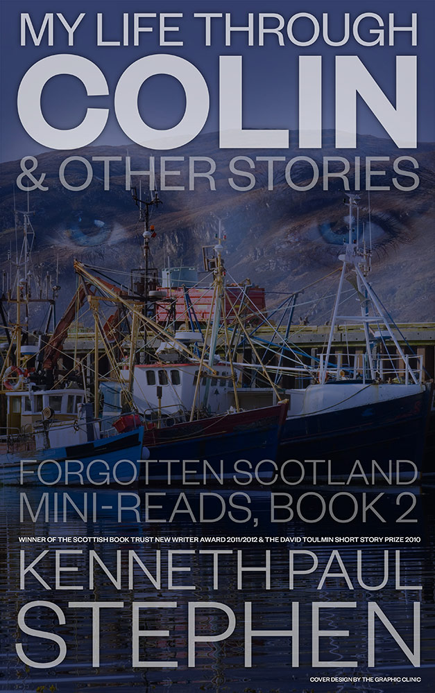
    02-Colin-and-other-stories-WEBWe’re delighted to reveal our second book jacket design for Kenneth Paul Stephen’s second book, My Life through Colin, part of his Forgotten Scotland Mini-reads.

    This book is part of, what we understand to be, a trilogy of books that explores the unseen Scotland of real people.

    You can buy a copy from Amazon here for 80p.

  • Intro talk at the Design Museum in London

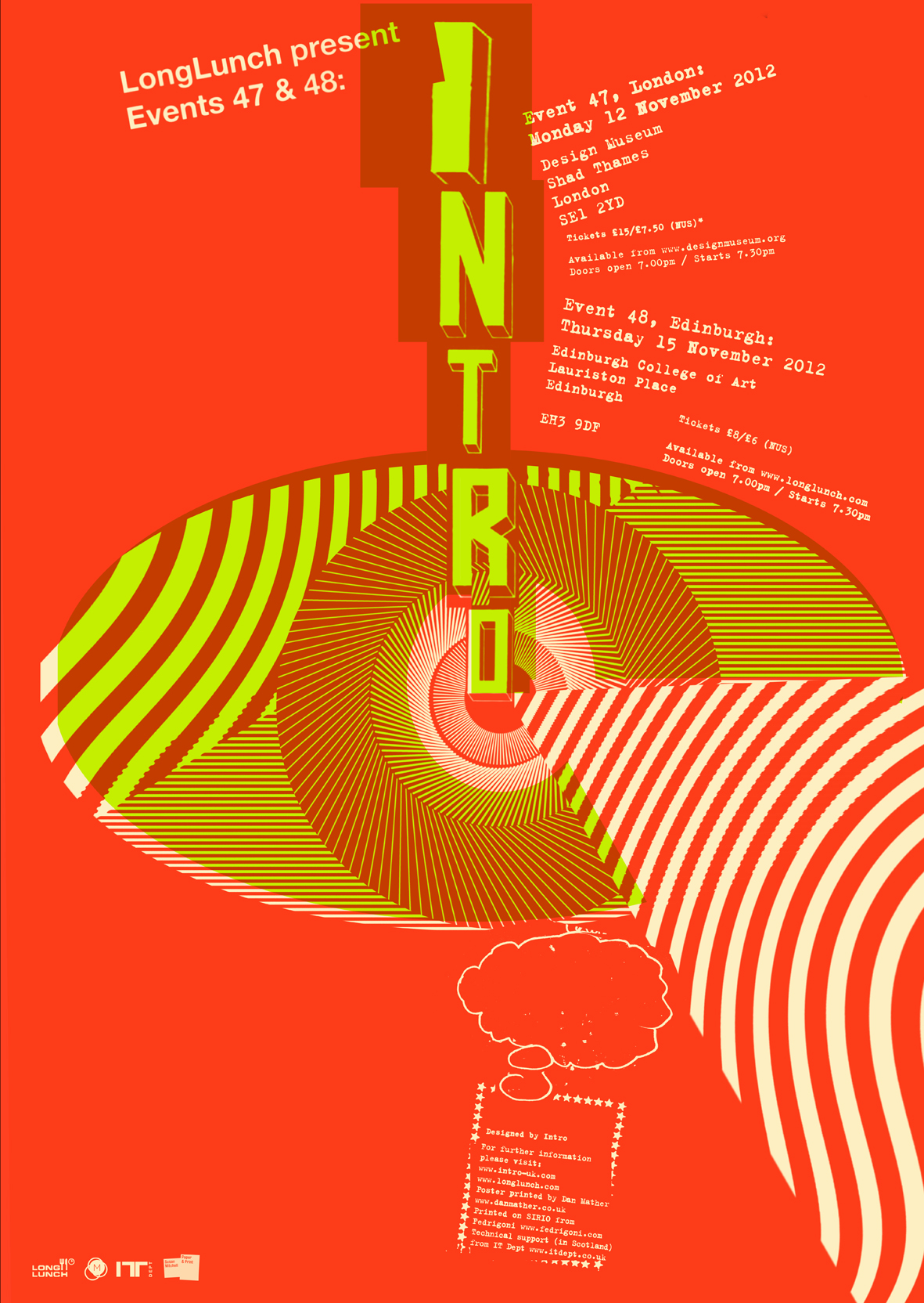
    Our Creative Director Brian continues his hard work with the design lecture series LongLunch and has arranged a talk at the Design Museum on the 12th from one of the UK’s most prominent design agencies of the last two decades.

    Intro’s Creative director Julian House will be talking about his design philosophies to a packed Design Museum, and then three days later will be flying to Edinburgh to do it all again for the Scottish Design community.

    There are still a few tickets left for both talks, available via www.longlunch.com.

    There will be free posters to give away, designed by Julian himself, and screen printed by Dan Mather.

  • Lost Pet Alerts

    Lost Pet Alerts

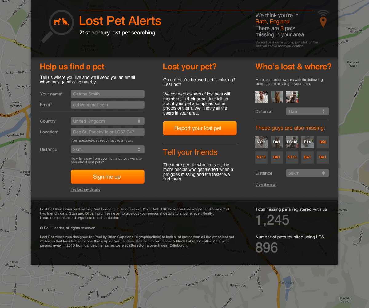
    Local (to me) web developer Paul Leader has created a 21st century way to find your lost pet, using a web app to notify you of lost pets near you that are added to the site. He’s a great developer but not-so-good designer so he asked for our help. This is what we did for him and what he’s currently re-skinning the site to look like.

  • Plymouth Half Marathon designs

    Plymouth Half Marathon designs

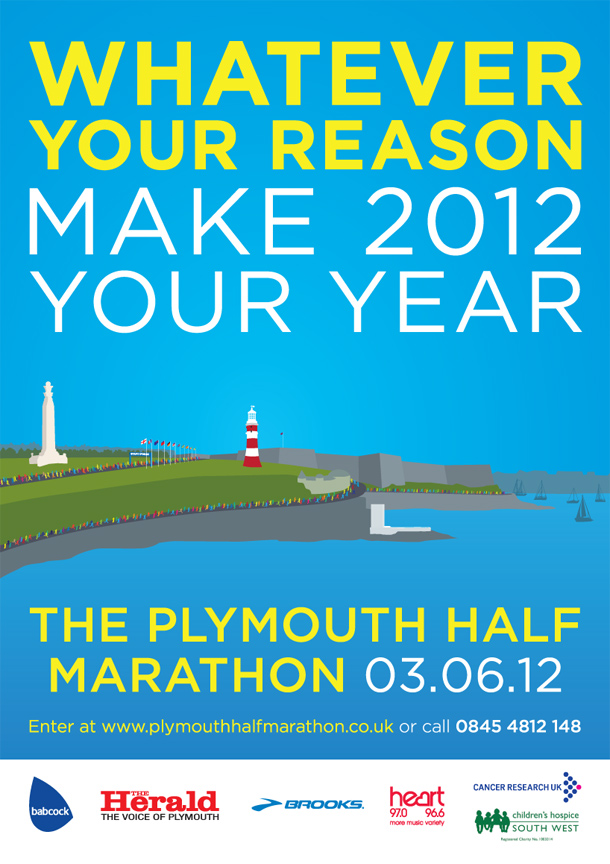
    A new look for Englands “riveria” half marathon

    We were approached at the end of 2011 to work with on some interim designs for the Plymouth Half Marathon in anticipation of a full rebrand for the annual event, this year taking place on the Queens Jubilee weekend. We took our creative lead from old postcards promoting the area as a holiday destination, picking out key landmarks on the marathon’s route such as the Tinside Lido, Smeatons Tower and the Hoe.

  • Why you (as a small business) shouldn’t be scared of the word “Brand”

    For the last two decades, at least, the big worldwide marketing and design groups – like Ogilvy, Interbrand and WPP – have been espousing the virtues and powers of the brand and charging handsomely for their wisdom. The list of multi-million pound rebrands is as endless and the figures quoted for the work. The resulting feeling amongst the rest of the business world (outside the FTSE250) is that branding is big bucks stuff. That your marketing budget needs to be as bloated as Mr Creosote to even consider uttering that fabled 5 letter word. You can almost feel the vibrations when marketing directors and business owners across the country shudder in fear when their new designer asks them for a copy of their “brand guidelines”. How could they ever afford to have such a weighty tome prepared for them? Surely to do so would require a grovelling trip to the bank manager with an embarrassing retreat as they are laughed from the building?

    I’m here to tell you that that fear is a load of tosh. The fact is that branding shouldn’t cost the equivalent of an African dictators golf buggy. It is affordable, surprisingly affordable.

    Here’s why. Brand strategists work hand in hand with graphic designers to build a brand. They do much of the initial thinking and the designer does the rest. He or she is then the one that pulls together these biblical “guidelines” documents. They are the ones who work on the colour relationships, the typefaces, the tonal variations, the uses in varying territories, the image style banks and so on. As such they become strategists themselves, able to advise the client in the absence of their colleague on a whole host of related issues. But these minds don’t always stay at the big firms forever, the get restless and move on, or better still – set up on their own.

    Of course there is a reason the big agencies can charge such high fee’s. It’s because getting a brand right and applying it well across all customer channels can add noughts onto a companies bottom line. Coca-Cola, for example, through consistently excellent application of it’s brand to it’s product has grown to have a brand value of £70.4bn (src: Interbrand “Best Global Brands Report 2010). That’s some serious numbers!

    So here’s the tip. Seek out a graphic designer who has experience dealing with big “brands” but who now works for a small firm, or themselves. Then you can get all the big thinking for an affordable price. And remember, don’t fear the word; embrace it and your company will be much better off for the investment.

  • English Heritage timeline concepts

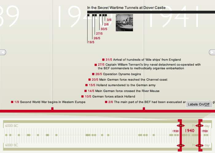
    I was recently invited by Glasgow based Digirati to submit designs for a timeline they’re producing for their client English Heritage. There was quite a lot of information required to create a flexible timeline that can be used for all the organisations properties, allowing for multiple timelines within the main timeline and a global timeline and scaling options. The solution was to extract elements from the EH logo to form the main red timeline and try to indicate on the global timeline where clusters of information were thus helping guide users to points worth exploring. Visually it’s all kept very much on-brand with the EH guidelines to ensure the timeline sits comfortably into the website. The brilliant guys at Unwrong in Brighton will be doing the build in Flash.