 Can she really be 40? Well, it would appear so, and in true Supermodel style she threw a big party, filmed it, and then needed a nice cover that was a stunning as she was (er, is!). Not a bad brief really. She, and her partner, apparently loved it. Printed onto gold paper for the extra super shine.
Category: Portfolio
-
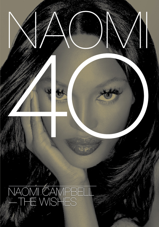
Naomi Campbell 40th birthday DVD
-
New ad campaign for Sugababes

We were asked in the summer to help Rachel at Rebel State pull together an ad campaign for the new Sugababes fragrance collection. We worked alongside the photographer, retoucher, client and her clients (the Sugababes, their management and the fragrances company) to put together a classic design for the girls working with the packaging designs already produced.
-
World Cup chart competition entry
Wallchart updated 30/06/10 to include all results to date and Quarter final ties

Our friends at The Drum magazine are running a competition to design a World Cup wallchart to help follow the up coming tournament this summer. We spent hours looking at other wallcharts out there and decided that a clear, crisp and typographic solution was the way forward. We’re so pleased with it we thought we should share it beyond the competition — after all, it might not win — so we’re putting it online here for you to download and print off yourself.
We plan to update the chart as the tournament progresses with scores, final group tables, last 16, quarter, semi and final scores and teams, giving you a full picture of the event as it progresses. Can you tell we love our football?
We should point out that this is an unofficial item and is in no way endorsed by FIFA. Any infringement of copyright or naming rights is purely accidental.
-
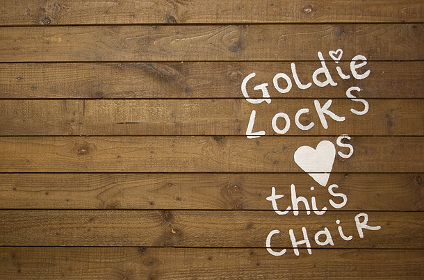
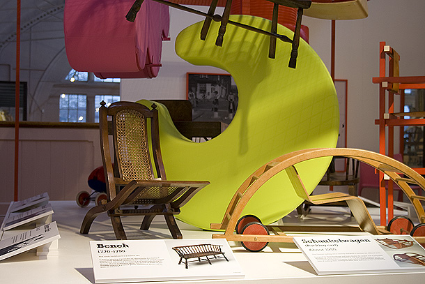
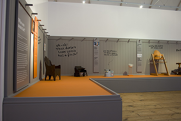
More V&A exhibitions images
The stencil produced for the ‘materials’ wall

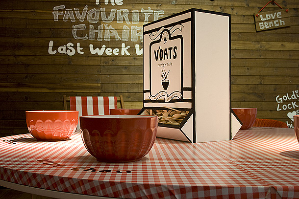
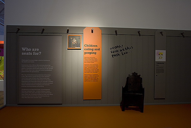
The ‘materials’ wall, otherwise known as the “How are seats made” section of the exhibition

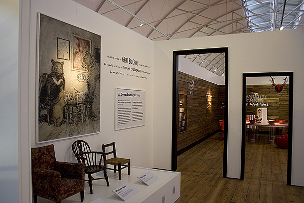
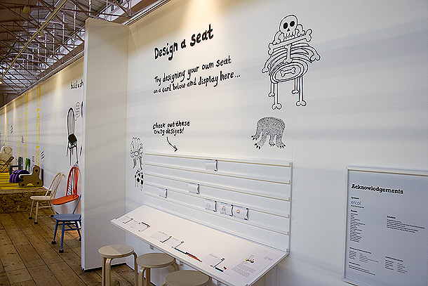
The “play” section of the exhibtion


A Tripp Trapp highchair, something I will be buying for my baby thanks to discovering it during this project

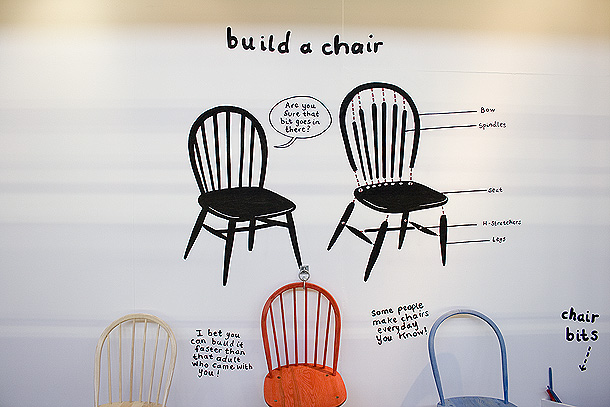
Some nicely typeset Rockwell. It’s a nightmare font and every headline, and indeed much of the body text in the exhibition required kerning.

The exhibition has some interactive elements for kids, for which we produced little voting cards in this instance, so they can vote for whether the stools designed by New Bucks Uni students should go into production…

…and these ones for them to design their own seats and post them for all to see on the wall.


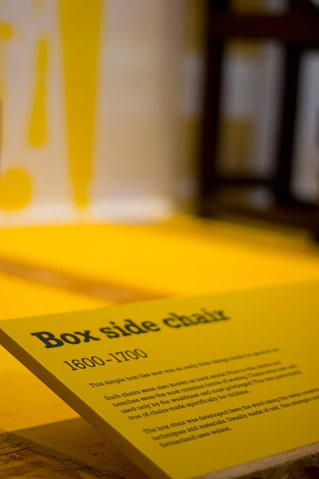
Details of object labels


-
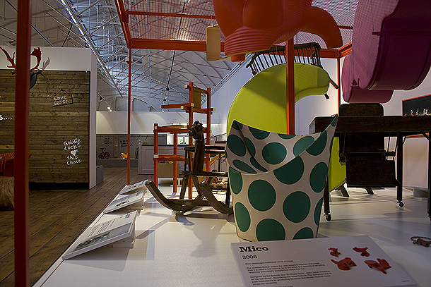
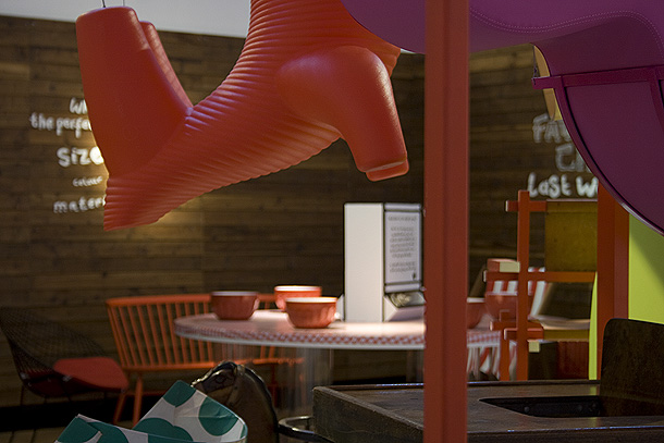
V&A Museum of Childhood images from the exhibition
If you can’t make the time to take a trip to Bethnal Green in London’s east end before September here are a whole load of images we took at the exhibition we designed (in partnership with Wells Mackereth Architects and commissioning Emma Houlston) for the Victoria and Albert Museum’s Museum of Childhood temporary exhibtion on child seating through the ages.


-
Ignite – designing a sub-brand
We’ve just completed a logo design for one of our long-standing clients, Nucleus, for a new sub brand of theirs called Ignite. Taking into consideration all the factors in a sub-brand design, we’ve produced the shown logo (below). We think it’s spot on and sits perfectly into all their existing marketing material. They think it’s “absolutely brill”, which is nice.

-
In the midst of darkness another Nucleus Christmas card persists
This year, after discussions with the client, we decided to resurrect an idea used three years ago – whereby we made their Xmas card a year long calendar too. So, armed with another inspiring quotation from Ghandi “In the midst of darkness, light persists”, we created another seasonal mailer that reinforces their brand values.


-
Barclays Wealth Protected Investments site goes live

It’s been a year in design and development, so we’re only just a little bit proud that we’ve finally launched the new website for Barclays Wealth Protected Investments. The site features pricing feeds, a back catalogue of their investment products and a much improved design and user experience. Next up a second printed guide to complement the Portfolio Planning Guide we produced for them earlier this year.
-
Coodham gets an update
We’ve recently finished an update to the award commended website for property development Coodham Estate, in leafy Ayrshire. The development of luxury properties south west of Glasgow from Goldrealm.
We’re working in partnership with other creative agencies (as we regularly do) on this project, with our good friend Mick Dean at Various and Grant Dain, SEO specialist.
-
Original Designers Workbooks delivered!

http://www.originaldesignersworkbook.com/
We now have them in our grubby little paws, yes the ODW has finally made it to N&E Towers (well, the office)! They will be available from Friday via Analogue Books once we get a batch delivered to them. If you are a retail outlet interested in stocking them, please contact us at North & East and we’ll open discussions on how many you think you’d like. For individuals, please visit Analogue, they’ll sort your order out.
